Since last week, my project has gone through many iterations and transformations. Please see below for documentation and short descriptions, including thoughts on my latest peer critique and next steps.
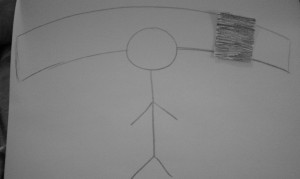
Mock-ups for an installation piece, experiencing an earthquake through light. The feedback I got from my peers steered me away from this iteration, mostly because my prototypes were unable to clearly communicate my vision and the user experience of the proposed piece. This quickly got me back on track of my initial goals; I’m not necessarily looking to visualize the experience of an earthquake, specifically, but instead to create emotional resonance for users when experiencing data.

This was an early prototype of some functional openFrameworks code. I parsed a feed from the NYT API and comparing it to Twitter responses, but I did not think the visualization was creating any meaning.
Earthquake Ticker from Tami on Vimeo.
Another prototype, this time creating an effect to mimic a Richter Scale. Again, this visualization did not really create meaning for me or potential users.
Final Richter Scale from Tami on Vimeo.
I decided to step back and re-examine my initial concept. What exactly do I want users to take away from this experience? It is important that users connect to the news data, no matter the topic. Focusing on frequencies and clusters of keywords, the timeline of the data, the natural contours of the data and data overlaps, and natural redundancy are strategies I am planning to employ in my next iterations. I need to isolate meaningful data, manipulate the sources to show what I want, and then correlate the results I find. While my college statistics professors would probably cringe at the previous statement, I think it is less important to visualize statistically correct data and more important to lead users to connect with the data (even if semi-falsely). In keeping with the earthquake theme and metaphor, I also want to explore the idea of aftershocks. How does the media portray an even after the fact? How often do the talk about the chaos, destruction, survivors, costs, aid, etc?
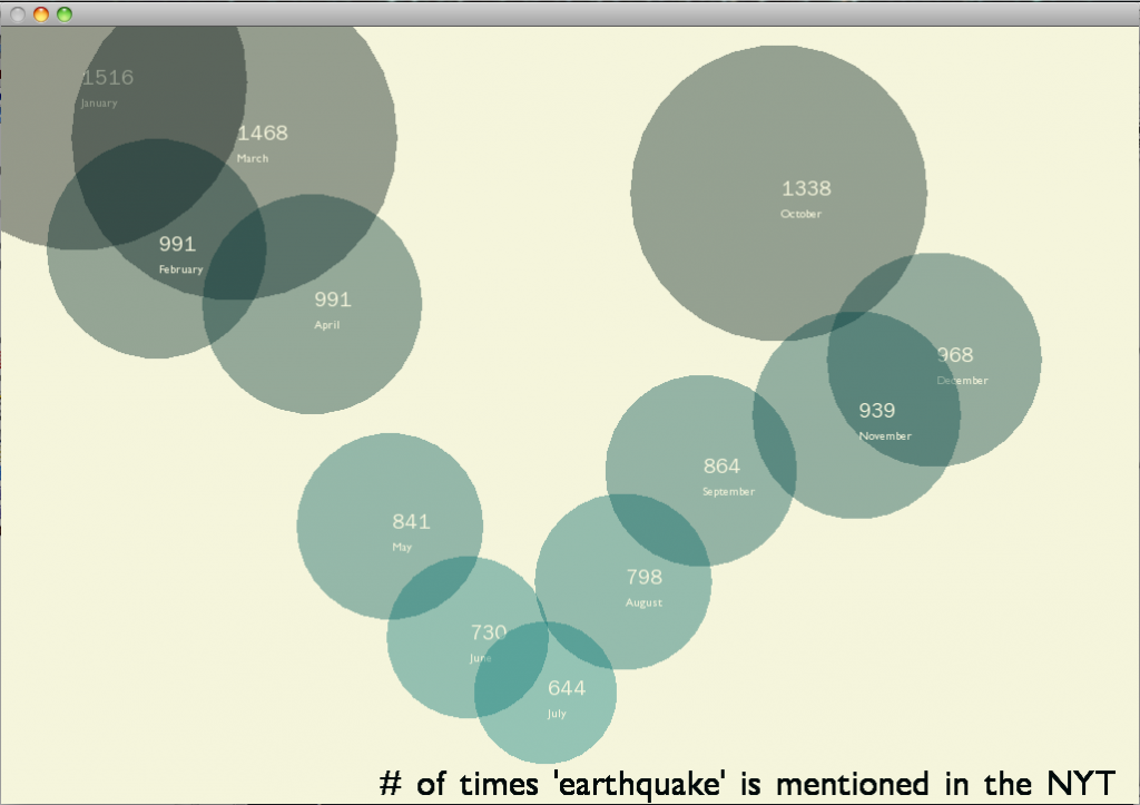
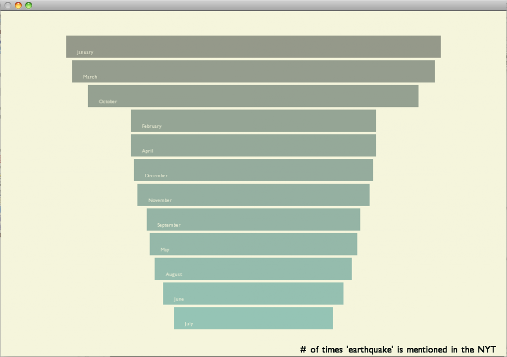
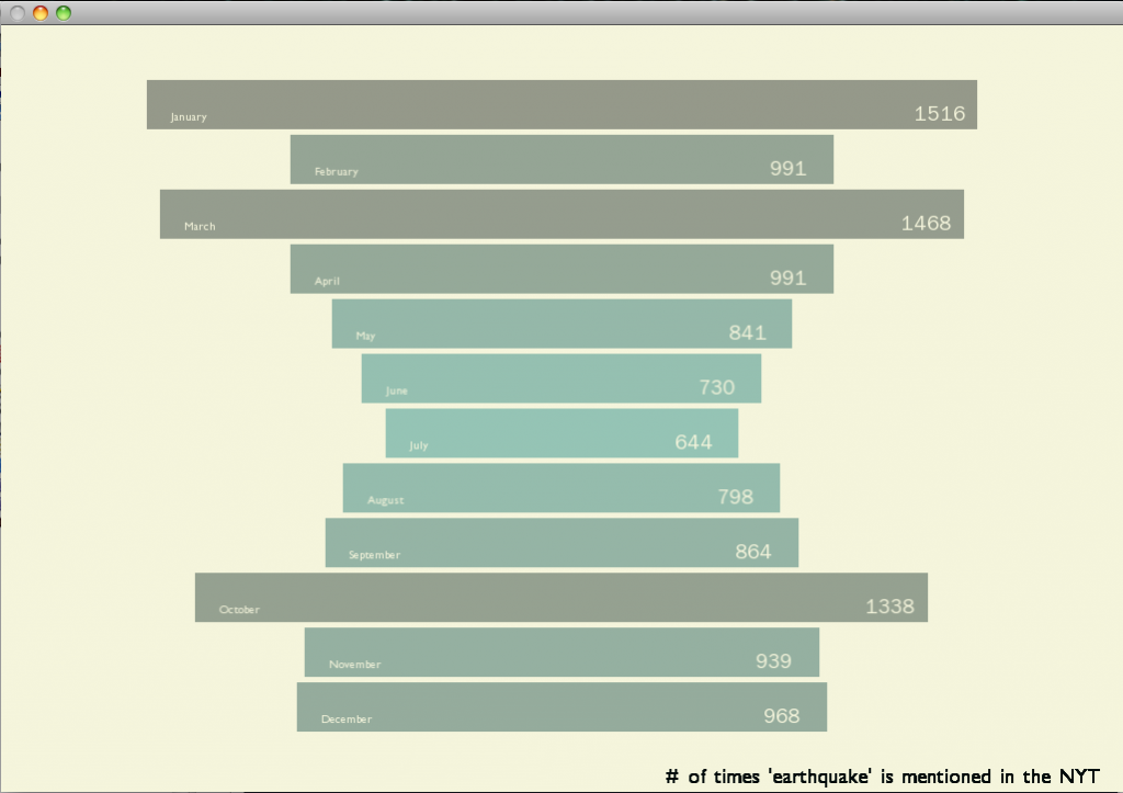
Already I have begun to explore the different data search options provided by the NYT. The below visualizations are different iterations of the same idea. How often is the term “earthquake” mentioned in NYT articles every month? Hopefully by comparing this data to seismographic data, we can see the media richter scale that correlates to the physical richter scale. I have had a fun time exploring different visualization options and hope to be able to create an interactive, explorative tool for users to peruse the vast amounts of data.
Iteration #1 – values as relatively sized and placed circles.
Iteration #2 – values as relatively sized bars
Iteration #3 – values as relatively sized bars, in timeline order
In-class presentation, 4/19
Tags: earthquake, iteration, process, project, thoughts